Brand Identity / UI-UX / Digital Product / Art Direction

I LEAVE.
YOU ARRIVE.
Io esco. Tu entri.
Ostia, Rome · 2026
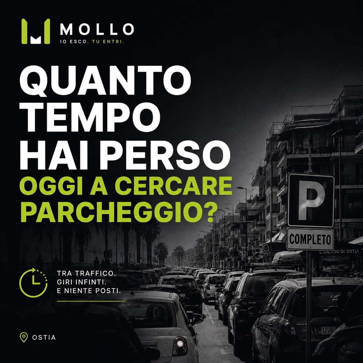
THE CITY IS MOVING. PARKING ISN’T.
Searching for parking interrupts the everyday rhythm of the city. MOLLO starts with a familiar question: how much time did you lose today looking for a space?
ONE LEAVES. ANOTHER ARRIVES.
MOLLO
Someone signals a space they are about to leave.
TI AVVISO
The concept connects the person searching with a reported availability.
LO PRENDI
They reach the indicated point and check whether the space is still free.
A shared signal, not a reservation. Availability must be checked on arrival. The notification step belongs to the concept: automatic alerts are not presented here as a verified feature of the current prototype.
A SYMBOL OF MOVEMENT.
The MOLLO logo begins with the app’s central gesture: I leave, you arrive.
Two vertical lines mark a parking bay. The space between them opens into a negative M, MOLLO’s initial: the space one person leaves becomes an opportunity for someone else.
The parking bay
Two lines define the space.
The handover
The space becomes available and changes user.
The community
An individual gesture creates a shared benefit.
Lime makes the symbol immediate, energetic and recognisable on the map; Ink communicates reliability and technology. Geometric forms and open lettering give the identity a simple, contemporary urban character.
MOLLO is the space that passes from you to someone else.
“Io esco. Tu entri.” expresses the app’s idea in its shortest, most memorable form.

Interface palette · Manrope: regular, medium, semibold, bold and extra bold. Original artwork retains its own colour values.
LESS SEARCHING. MORE LIVING.
The web prototype brings the identity into an interface designed around Ostia, shared availability and a simple everyday gesture. Explore the digital experience in its original language, Italian.
A BRAND BUILT TO BE NOTICED.
Three original posters connect the urban problem, the promise and the gesture. Photography and oversized type make the message immediate; the navy and lime identity keeps the sequence recognisable.
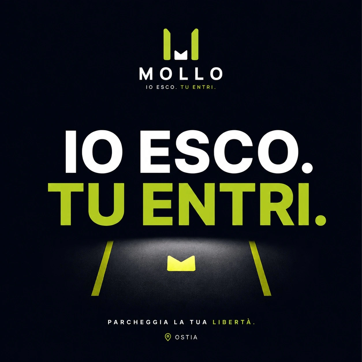
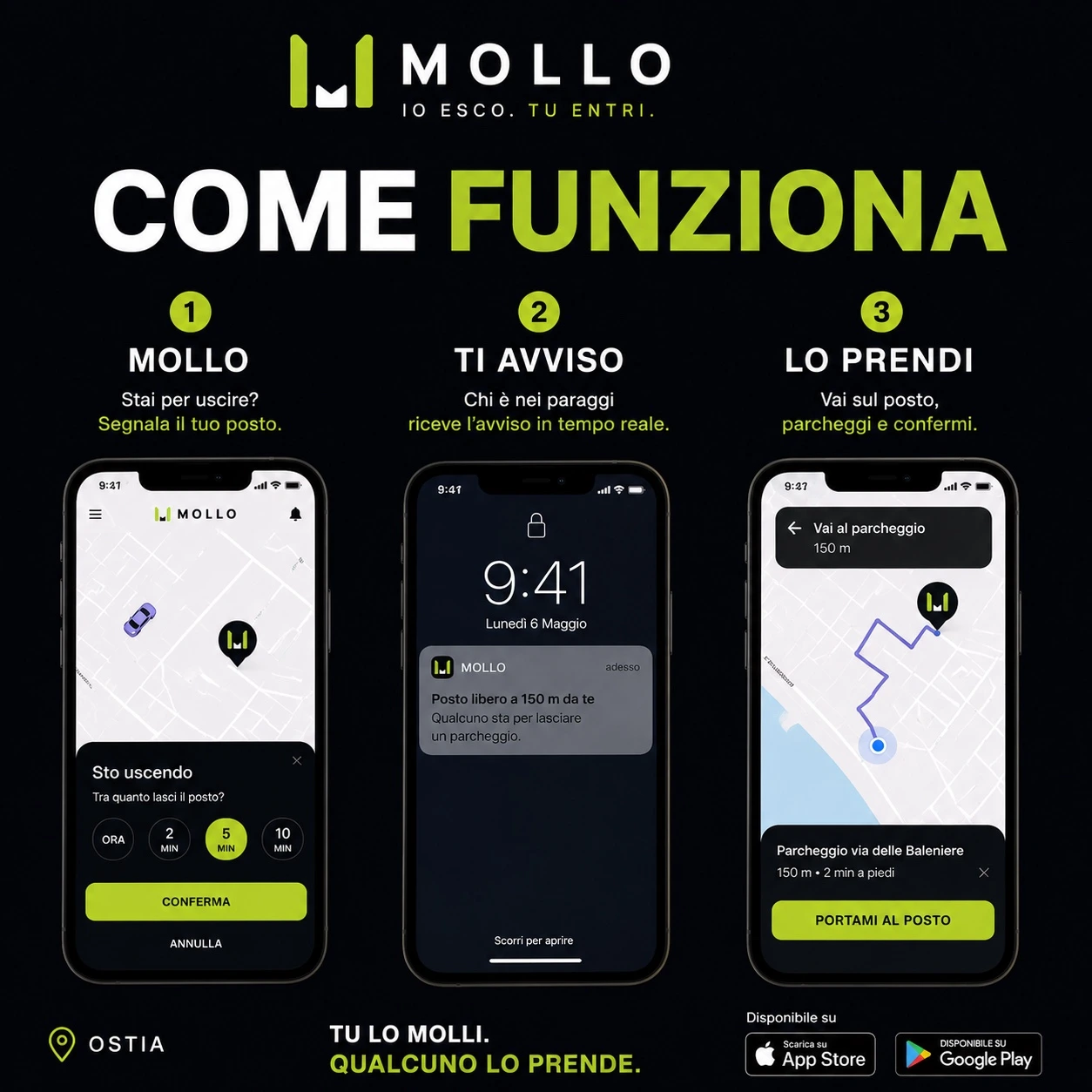
The third original poster appears in the opening challenge. Campaign phone mockups illustrate the concept; they are not evidence of push notifications or app-store availability.
FROM CONCEPT TO DIGITAL EXPERIENCE.
The idea
Turn the moment of leaving into information someone else can use.
The prototype
A navigable web interface with an Ostia map, parking controls, community and settings. The live notification panel currently states that there are no notifications.
The next questions
Automatic alerts and the reliability of shared availability remain development questions. No user numbers, commercial validation or performance results are claimed.